


Lexicon links
Wednesday, 06Feb2019 Filed in: Webmaster
Technopagan Yearnings is designed to look like a sloppy scrapbook on life topics, but mainly paganism. The lexicon is going to be the most important part of that. I wanted the lexicon to be very distinct.
So I started with the links.
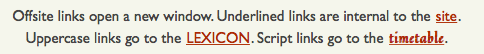
No, this isn't standard link behavior. At TPY, hover over an internal link and the words get bigger as if to say "click me" in a very friendly way.
There are actually two types of lexicon links, one is used manly for menus. Here's an example of how that looks.
Since these are internal links, they show some of the same behavior as the NWC link. But they also have their own quirks. They are uppercase, and the menu links look like buttons.
Eventually the timetable will be a big resource too. But it's very easy to specify a script font.
Once again, it's an internal link. The only practical difference is the font.
Along that same line, I want to throw in another type of link. Sometimes the original sources I link suffer from link rot. Either the site is shut down or that page is gone.
This is a very different behavior behavior. It's hard to read and has a line through it. Now the link shrinks when the visitor hovers over it as if to say "don't click me."
There are a couple of variations. Sometimes I have links on a red banner.
It's the same behavior, but I make the link color white.
And finally the images.
All this does is remove the default highlight from around an image used as a link.
So I started with the links.
Here's the CSS for the in-site link.
a.nwc:link, a.nwc:visited {text-decoration: underline;}
a.nwc:hover {font-size: 113%; font-weight: 700; background-color: transparent; background-image: none; text-decoration: none; text-transform: none;}
a.nwc:hover {font-size: 113%; font-weight: 700; background-color: transparent; background-image: none; text-decoration: none; text-transform: none;}
No, this isn't standard link behavior. At TPY, hover over an internal link and the words get bigger as if to say "click me" in a very friendly way.
There are actually two types of lexicon links, one is used manly for menus. Here's an example of how that looks.
![]()
And here's the CSS for that and the lexicon link I use in blocks of text.
a.lex:link, a.lex:visited {border-radius: 13px; letter-spacing: 2px; color: white; background-size: auto; background-color:#0A4F00; padding: .3em .7em; font-size: 75%; text-decoration: underline; text-transform: uppercase;}
a.lex:hover {font-size: 85%; font-weight: 700; text-decoration: none; text-transform: none;}
a.lexicon:link, a.lexicon:visited {text-decoration: underline; text-transform: uppercase;}
a.lexicon:hover {font-size: 113%; font-weight: 700; background-color: transparent; background-image: none; text-decoration: none; text-transform: none;}
Since these are internal links, they show some of the same behavior as the NWC link. But they also have their own quirks. They are uppercase, and the menu links look like buttons.
Eventually the timetable will be a big resource too. But it's very easy to specify a script font.
![]()
a.timeline:link, a.timeline:visited {text-decoration: underline; text-transform: none; font-family: 'Quintessential', cursive; font-weight: 600;}
a.timeline:hover {font-size: 1.13em; font-weight: 700; background-color: transparent; background-image: none; text-decoration: none; text-transform: none;}
a.timeline:hover {font-size: 1.13em; font-weight: 700; background-color: transparent; background-image: none; text-decoration: none; text-transform: none;}
Once again, it's an internal link. The only practical difference is the font.
Along that same line, I want to throw in another type of link. Sometimes the original sources I link suffer from link rot. Either the site is shut down or that page is gone.
Here's the CSS.
a.broke:link, a.broke:visited {text-decoration: line-through; color: #C0C0C0;}
a.broke:hover {font-size: 87%; text-decoration: none; color: white; background-color: #C0C0C0;}
a.broke:hover {font-size: 87%; text-decoration: none; color: white; background-color: #C0C0C0;}
This is a very different behavior behavior. It's hard to read and has a line through it. Now the link shrinks when the visitor hovers over it as if to say "don't click me."
There are a couple of variations. Sometimes I have links on a red banner.
a.rednwc:link, a.rednwc:visited {padding: .3em; text-decoration: underline; background-size: auto; background-color: transparent; color: white;}
a.rednwc:hover {color: white; font-size: 113%; background-color: transparent; background-image: none; text-decoration: none; font-weight: 700; none; text-transform: none;}
a.rednwc:hover {color: white; font-size: 113%; background-color: transparent; background-image: none; text-decoration: none; font-weight: 700; none; text-transform: none;}
It's the same behavior, but I make the link color white.
And finally the images.
a.image:link, a.image:visited, a.image:hover {background-color: transparent; background-image: none;}
All this does is remove the default highlight from around an image used as a link.
blog comments powered by Disqus